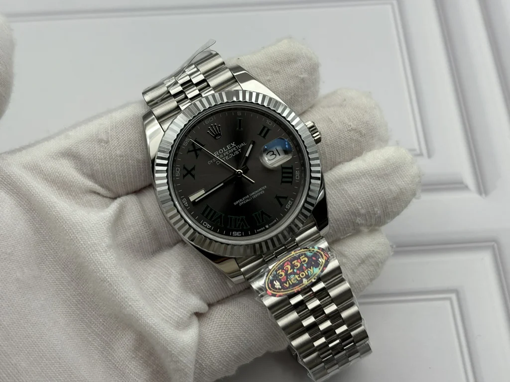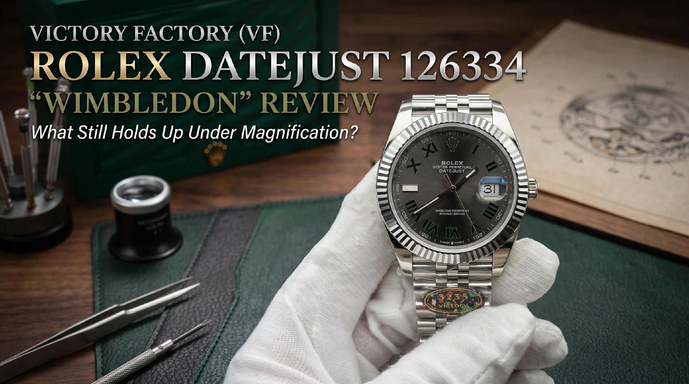
There is a point at which a Wimbledon dial stops being simply grey, green and black.
Move it toward a window and the slate surface becomes lighter. Rotate the case a few degrees and the Roman numerals suddenly appear almost black. Bring the watch under a macro lens and the green surrounding those numerals becomes the dominant feature rather than a minor accent.
That is precisely why this dial is so unforgiving.
A Daytona can distract the eye with subdials, polished hands and a ceramic bezel. A Submariner has strong geometry and large luminous markers. The Wimbledon Datejust is quieter. Its identity depends disproportionately on color separation, typography and the way several very thin boundaries behave as the light changes.
Get one of those boundaries wrong and the whole dial starts to feel wrong.
That makes the latest Victory Factory Datejust 41 Ref. 126334 more interesting than its specification sheet suggests.
The question is not whether VF can produce a recognizable Wimbledon. That bar is much too low.
The useful question is what happens after the first impression wears off.
The Dial Changes Before the Watch Does
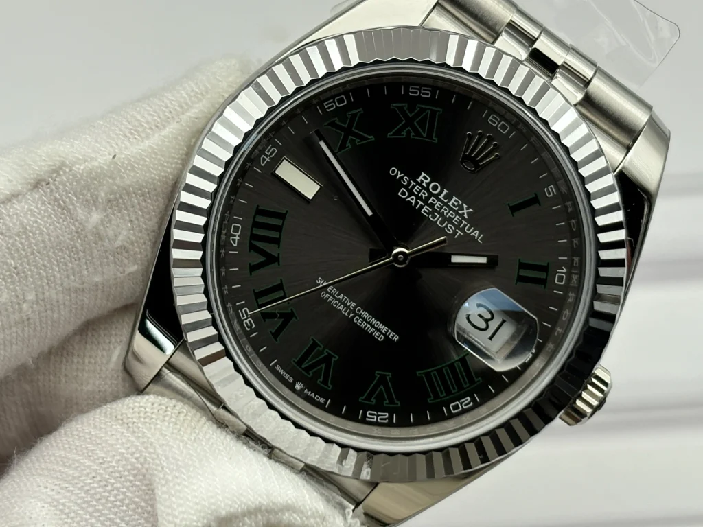
Viewed straight on under neutral indoor light, VF’s slate dial is convincing because nothing immediately demands attention.
That sounds like faint praise, but on a Wimbledon dial it is important.
Poor executions often announce themselves immediately. The grey can lean too silver, the green can become almost fluorescent, or the black centers of the Roman numerals can lose enough density that the entire dial appears flatter than it should.
VF avoids that obvious imbalance.
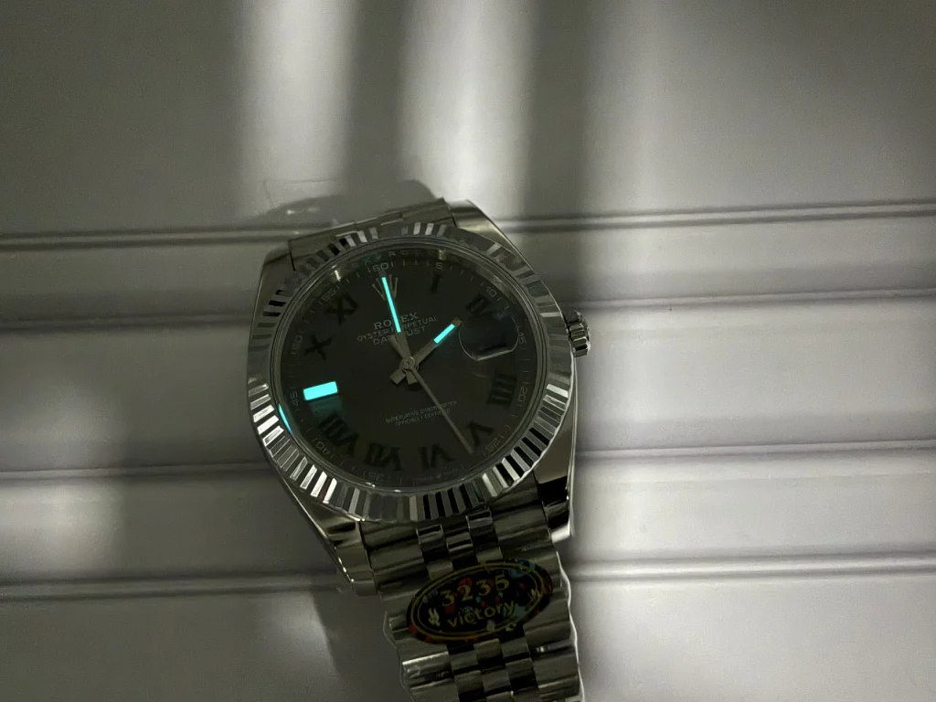
The radial brushing is visible without becoming coarse. Under stronger direct lighting, the slate surface opens into a lighter graphite tone, while at shallower angles it becomes considerably darker. The effect is not simply decorative; it changes the perceived contrast of the Roman numerals.
This is where the green border matters.
On the VF sample, the green does not look pasted around the numerals as a separate graphic element. There is enough definition to distinguish it from the black center, but not so much brightness that it becomes the first thing visible from normal wrist distance.
Macro photography changes the impression slightly.
The edges around narrow sections of the Roman numerals deserve more attention than the broad surfaces themselves. This is an area where excessive paint thickness, soft transitions or inconsistent borders become much easier to detect.
VF’s execution remains controlled. The serifs are clearly defined, and the transition between the dark numeral center and green perimeter is considerably cleaner than what is normally associated with inexpensive Wimbledon dials.
It is still the kind of detail that benefits from comparison rather than exaggerated claims of perfection.
And that distinction matters.
The goal of a high-tier replica watch is to reproduce the visual language of the original reference as closely as possible. It does not become the original simply because the difference is difficult to notice without magnification.
Why the 9 O’Clock Marker Matters More Than It Looks
The most unusual element on this dial is not one of the Roman numerals.
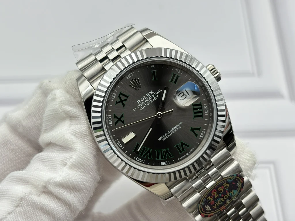
It is the single luminous baton at nine.
On paper, this appears almost insignificant. In practice, its position and proportion affect the balance of the entire left side of the dial.
A slightly crooked baton is surprisingly easy to notice because there is no second marker beside it to disguise the error. An overly thick metal frame makes it visually heavy. A weak luminous fill makes the marker look cheaper once the surrounding light drops.
VF gets the basic geometry right.
The polished frame remains narrow, the marker sits squarely in its position, and the luminous material produces the expected blue-toned appearance.
What interests me more is the relationship between the baton and the rest of the dial.
It does not visually fight with the Roman numerals.
That is important because the Wimbledon dial already combines two different design languages: traditional Roman typography and a modern luminous sports-watch marker. When the proportions are wrong, the nine o’clock baton looks like a replacement part rather than an intentional component of the dial.
Here it belongs.
The Bezel Is Best Judged While Moving
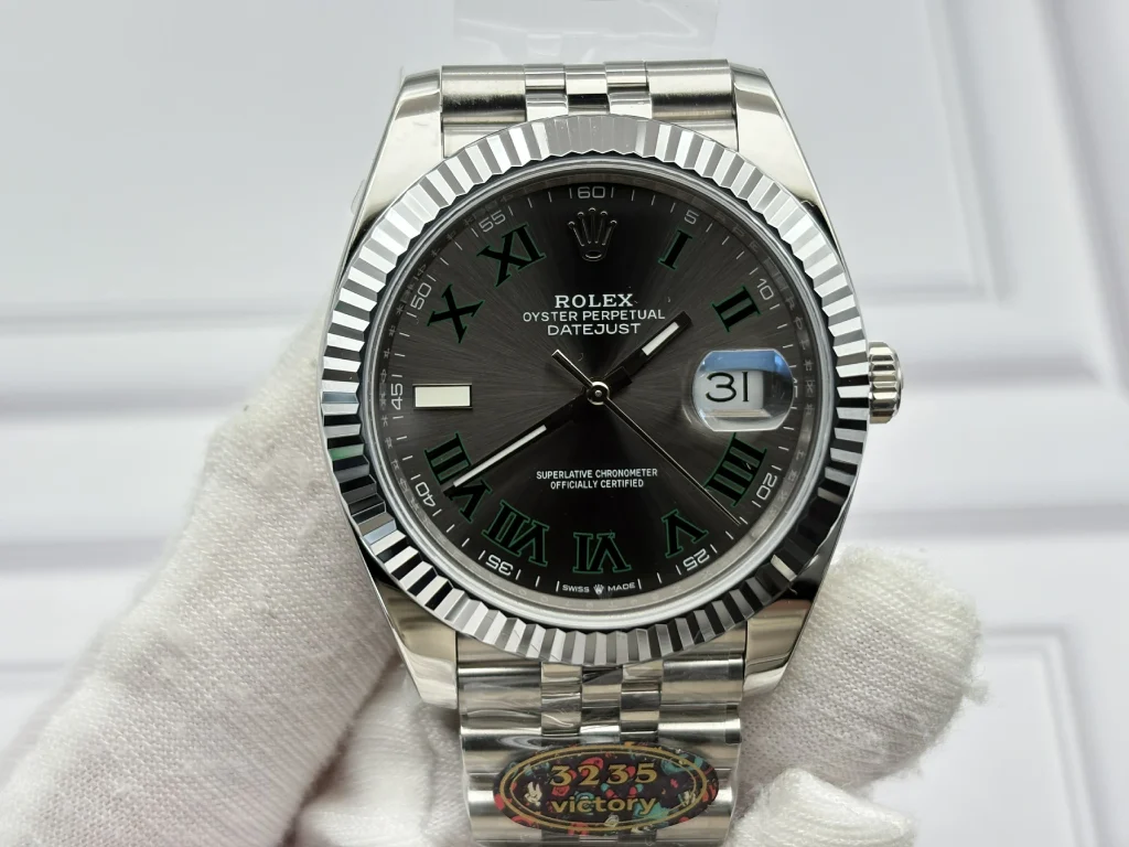
Still photography is not particularly kind to fluted bezels.
A photograph can show whether the peaks are sharp, but it cannot fully show how rapidly the reflections move from one facet to the next.
That movement is one of the reasons the Datejust bezel is difficult to imitate convincingly.
VF’s bezel performs better when the watch is rotated than when it is examined as a static object.
The triangular facets terminate sharply enough to produce fast changes between bright and dark reflections. The valleys do not look excessively rounded, and the outer perimeter does not give the bezel the inflated appearance sometimes seen when the cutting geometry is too soft.
This does not make stainless steel behave exactly like white gold.
Material still influences the character of the reflection.
But geometry can compensate for a surprising amount, and VF has clearly paid attention to the relationship between facet angle and reflected light rather than simply making the grooves deeper.
That is a more meaningful improvement than increasing shine.
The Cyclops Test Takes Only a Second
There are details that require magnification.
The Cyclops is not one of them.
If the lens is slightly misplaced, the eye notices it almost immediately because the enlarged date becomes an optical center of the entire right side of the dial.
On this sample, the magnification sits correctly over the aperture, and the date remains visually centered rather than being pulled toward one edge of the lens.
The useful part of examining it under magnification is not deciding whether the Cyclops exists or whether it enlarges the date sufficiently.
It is watching the transition between the crystal, lens and printed date underneath.
VF keeps this area relatively clean. The aperture remains clear without a distracting blue cast, while the date printing stays sharp enough that the magnification does not expose fuzzy edges.
This is exactly the kind of detail that becomes more important as the rest of the watch improves.
Once obvious errors disappear, smaller optical inconsistencies become much easier to see.
The Rehaut Is Quietly More Important Than the Bracelet
The Jubilee bracelet receives more attention because it is constantly being touched.
The rehaut deserves more scrutiny because it sits directly beside the dial.
Any inconsistency there is framed by the crystal every time the watch is viewed from the front.
VF uses clearly defined repeated engraving around the inner wall, and the relationship between the characters and the surrounding minute track is orderly on the examined sample.
The polished surface also matters.
An overly rough rehaut can make deep engraving look crude. Excessively shallow engraving produces the opposite problem, disappearing whenever the angle changes.
VF lands somewhere more convincing between those extremes.
It is not the first feature most people will inspect, but it is exactly the kind of area that separates a carefully finished build from one that merely has the correct parts.
The Case Reveals Itself at the Lugs
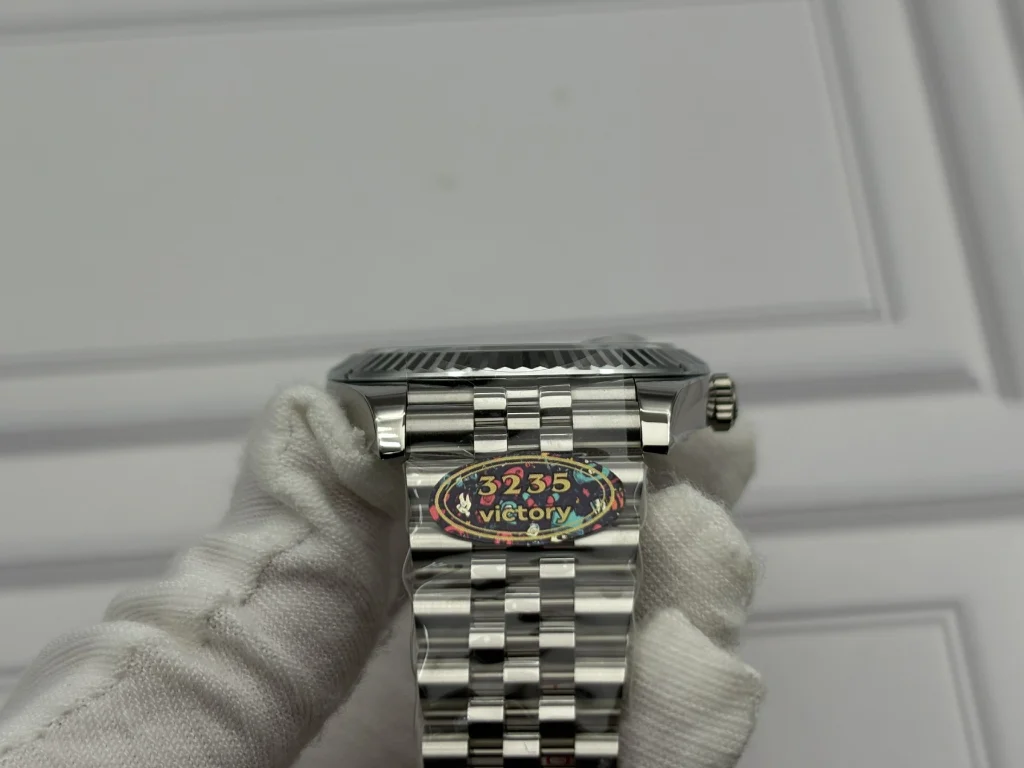
Instead of measuring the watch and stopping at “41mm,” look at the transition between the upper lug surface and polished case flank.
That line tells us more.
Modern Datejust cases are not supposed to look bulky just because the nominal diameter is 41mm. Their visual weight depends heavily on the shape of the lugs and the way polished and brushed surfaces intersect.
VF keeps the case under 12mm thick and preserves a relatively slim lug profile.
More importantly, the edges have not been polished into soft curves.
There is a visible separation between the brushed upper surfaces and mirror-polished flanks. That contrast gives the case definition when viewed diagonally and prevents the lugs from looking melted or excessively rounded.
This is also where the bracelet begins to matter.
The solid end links meet the case closely, with very little visible recess and little vertical movement when the bracelet is flexed.
An SEL gap may sound like a minor concern until it is seen beside a well-fitted example. Once noticed, it changes the perceived quality of the entire watch.
Here, the transition from case to bracelet looks intentional rather than assembled.
Then the Caseback Comes Off
This is where the tone of the review changes.
From the outside, the VF 126334 is primarily an exercise in visual tolerance.
Inside, it becomes a discussion about mechanical interpretation.
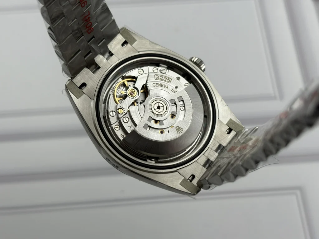
Removing the solid caseback reveals VF’s customized 3235-based movement rather than an older generic movement hidden beneath decorative plates.
That distinction matters.
The bridge arrangement, rotor presentation and overall architecture are intended to follow the visual layout of the 3235 family much more closely. Engraved surfaces, bridge decoration and the finishing of the visible plates give the movement a considerably more purposeful appearance than a simple cosmetic conversion.
But this is also the point where it becomes important not to confuse visual similarity with mechanical identity.
VF retains an adjustable regulating system.
That means the movement should not be described as mechanically identical to the free-sprung regulating architecture used by Rolex.
For servicing and bench adjustment, the conventional regulator is straightforward and practical. From a replication perspective, however, it remains one of the clearer mechanical distinctions once the movement is exposed.
I actually prefer acknowledging this rather than hiding it behind decoration.
A serious teardown should tell us where the resemblance stops.
Otherwise there is little point in removing the caseback at all.
The setting behavior is appropriately intuitive, the date change is clean around midnight, and hand setting operates in the expected direction. Winding and crown operation feel controlled rather than loose or excessively gritty.
Those characteristics matter more in daily use than whether every decorative surface can survive a photograph at ten-times magnification.
The Jubilee Has a Different Job
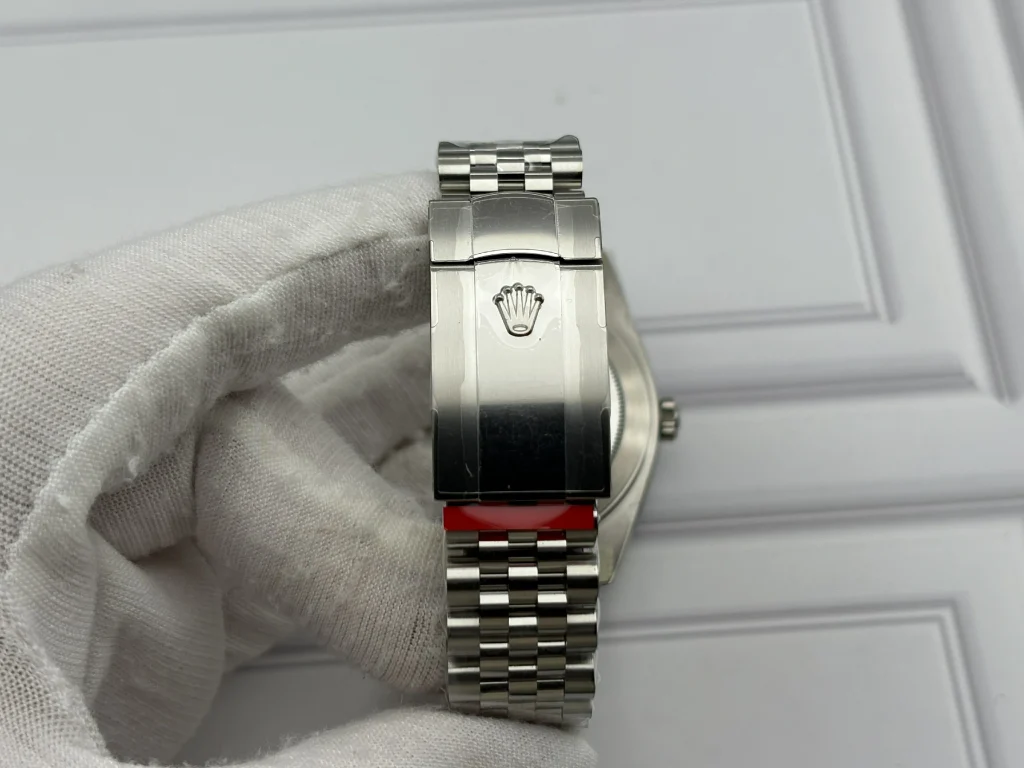
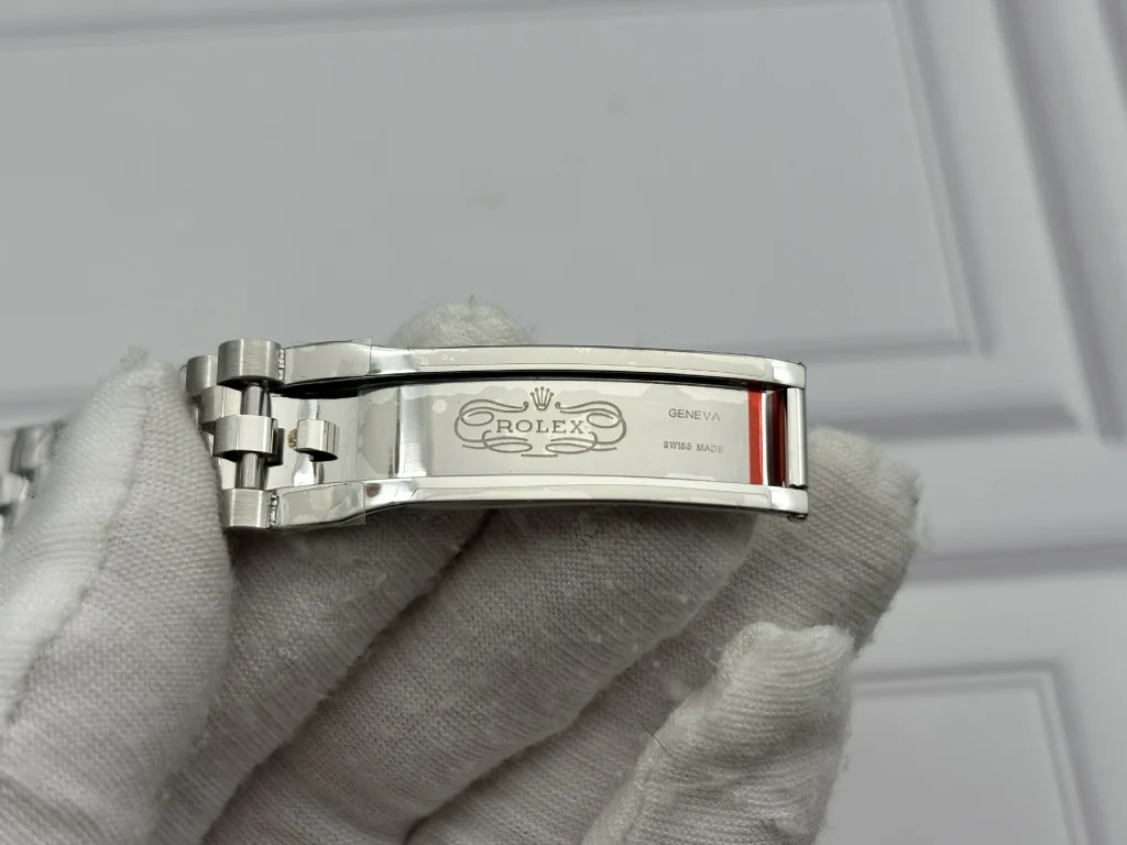
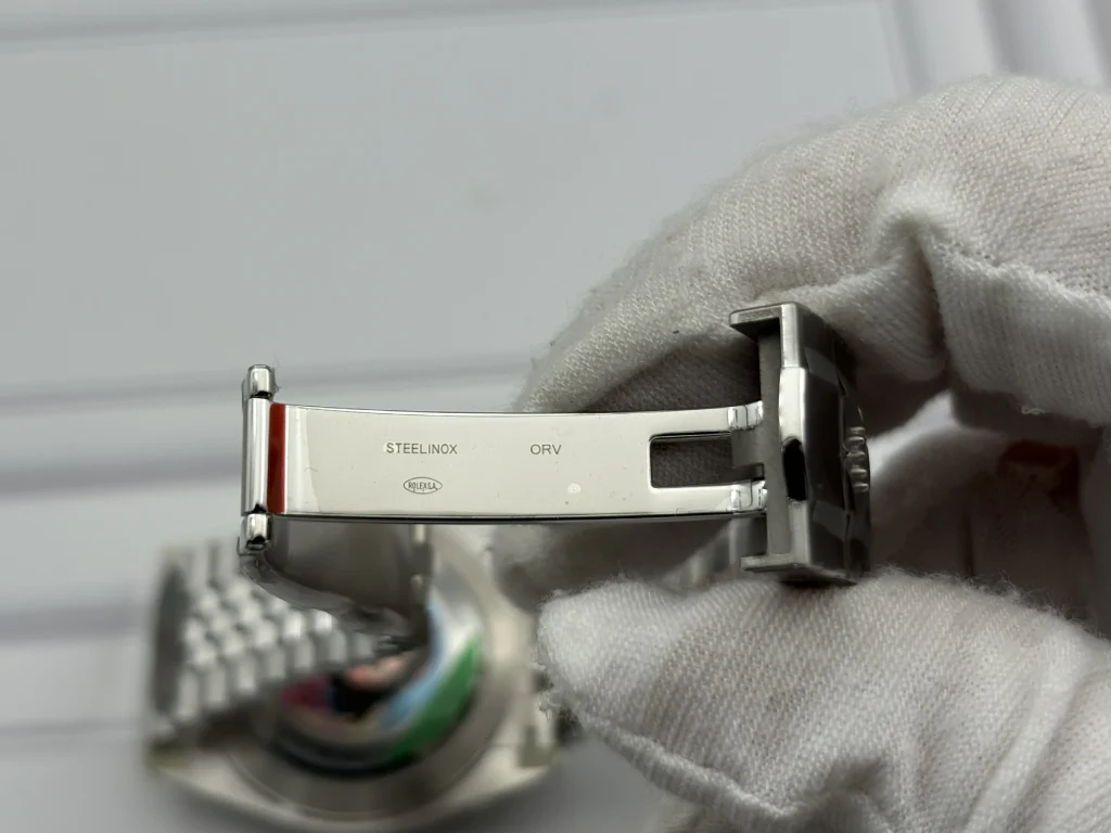
A Jubilee bracelet is easy to make shiny.
It is harder to make one feel right when it bends.
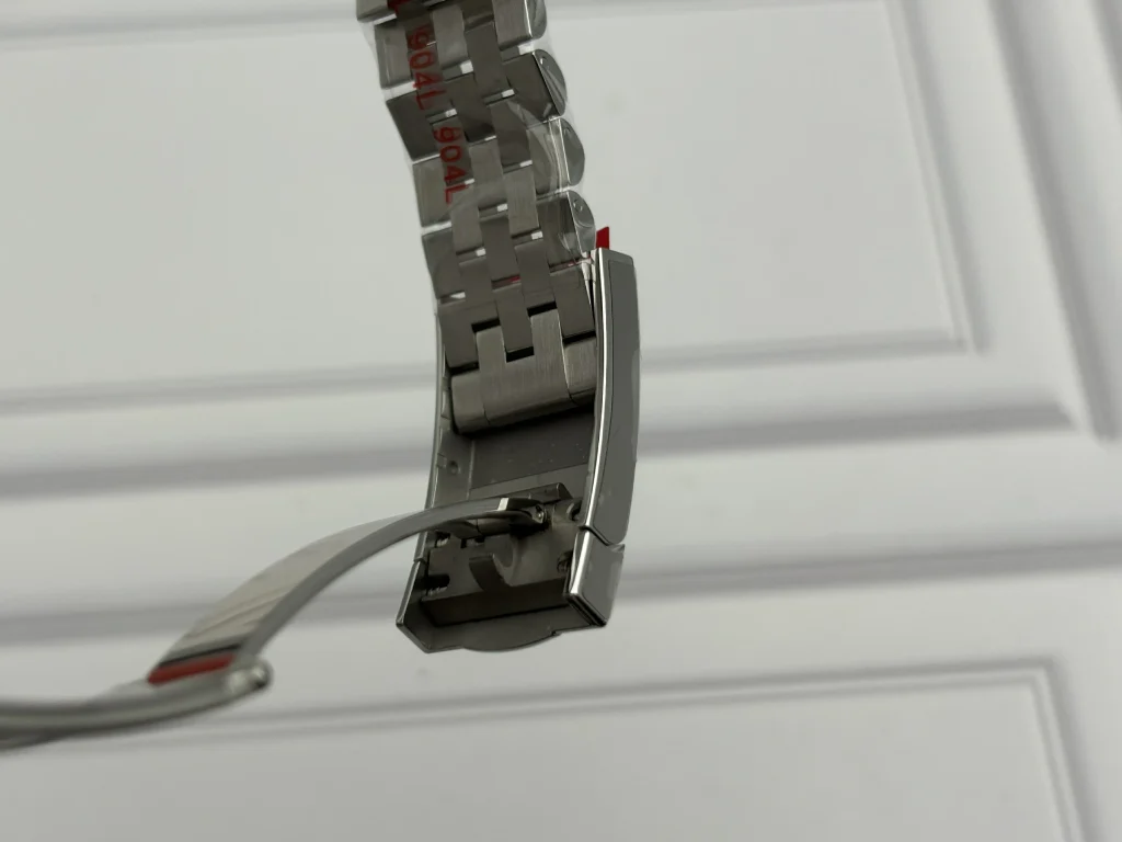
VF markets the bracelet as 904L stainless steel, but material designation alone does not explain why one bracelet feels better than another.
The more useful clues are articulation, edge finishing, lateral stability and the way individual links settle around the wrist.
The VF bracelet bends naturally without the stiff, wire-like resistance common to lower-level examples. Individual links move freely but do not immediately create the impression of looseness.
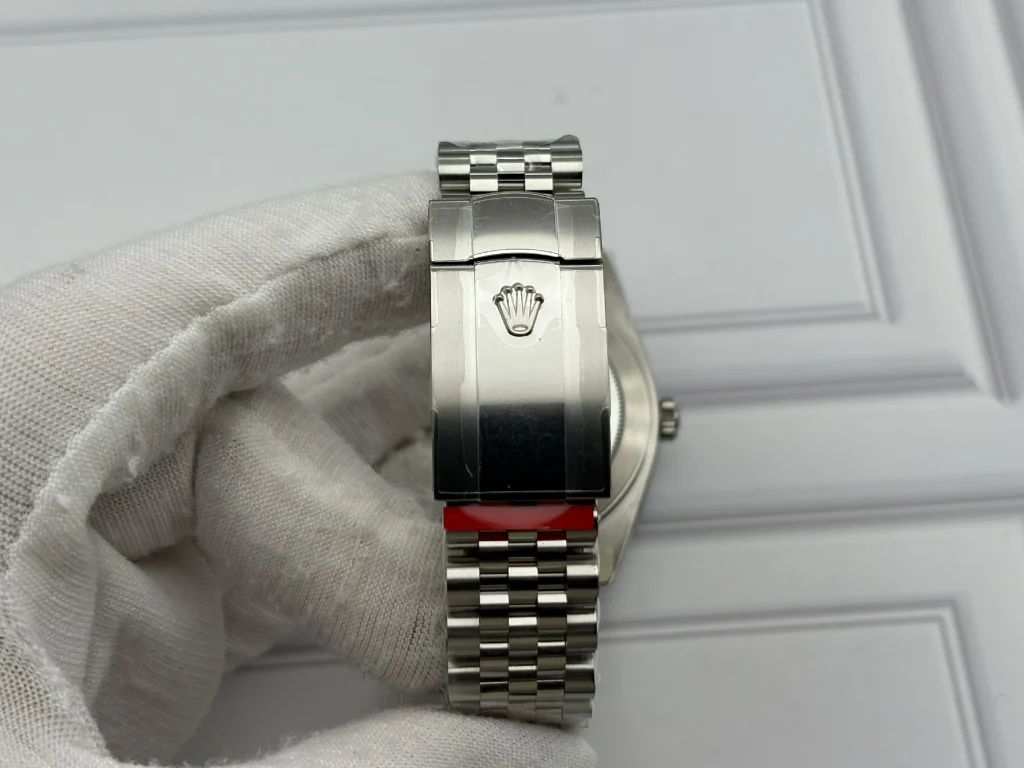
The Oysterclasp closes with a defined mechanical snap rather than a vague press-fit sensation, and the functional 5mm Easylink adjustment is useful for the small changes in wrist circumference that occur throughout the day.
Interestingly, this may be one of the areas least likely to impress in photographs and most likely to matter once the watch is actually worn.
A perfectly photographed bracelet can still feel poor.
This one makes more sense on the wrist than on a specification sheet.
What Gives VF Away?
This is the question that should come before any conclusion.
Not “Is it good?”
Not “Is it close?”
What actually identifies it when inspection becomes more demanding?
Externally, the differences are increasingly concentrated in small finishing behavior rather than gross dimensional mistakes. How the green edge behaves under macro magnification, how bezel facets return light, how typography reacts when viewed beside a known reference, and how tiny polished transitions are executed all remain more useful than generic claims about “1:1” construction.
Internally, the regulating architecture provides a clearer answer.
The custom 3235 presentation makes the movement visually much more appropriate for the watch, but the adjustable regulator means the mechanical solution is not identical to the genuine caliber.
That is not a criticism of whether the watch works.
It is simply an important boundary between replication and duplication.
And that boundary is exactly what good replica analysis should describe.
After the Loupe Comes Off
The most convincing part of VF’s Wimbledon 126334 is not any single component.
It is the absence of one obvious component that ruins the rest.
The dial does not become dominated by bright green numerals. The bezel does not look soft enough to undermine the case. The Cyclops does not pull the date visibly off center. The SELs do not create an obvious break between case and bracelet.
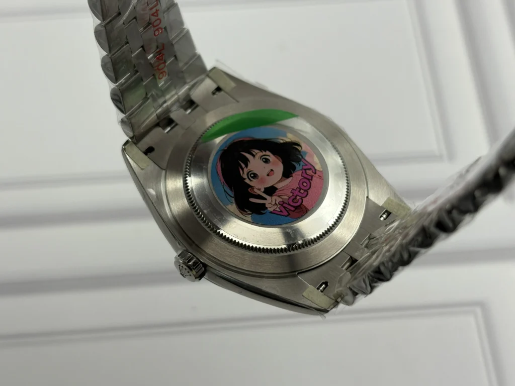
That balance matters because the Wimbledon is a watch of small relationships.
None of these elements is especially dramatic on its own.
Together, they determine whether the watch looks composed or merely assembled.
VF’s latest execution is therefore more interesting under magnification than the usual checklist review suggests. The exterior survives close inspection primarily because the factory has controlled several small visual tolerances simultaneously, while the opened caseback still provides an honest reminder that visual replication and mechanical replication are not the same thing.
That is a much more useful way to understand this 126334 than calling it simply “good” or “high-end.”
The Wimbledon dial has always punished shortcuts.
VF’s achievement here is that fewer of those shortcuts are immediately visible.